

Circuit City
Rebranding, Championing DIY Tech and Circular Economy
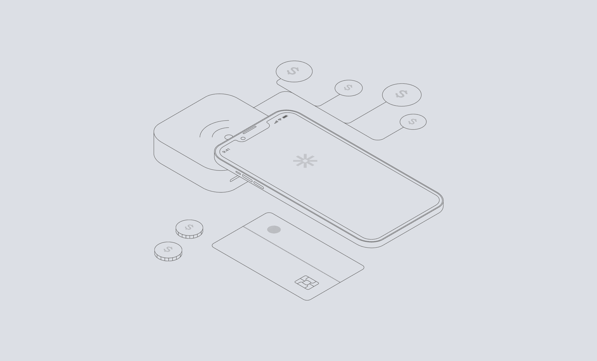
In my rebranding project for Circuit City, I transformed the brand from a traditional electronics retailer to a modern hub for refurbished electronics and DIY workshops. This new model emphasizes sustainability, community engagement, and education, responding to the increasing demand for affordable and sustainable technology.
Read the full case study for this project
Goal
Bring Circuit City back to life with a new feeling, look and concept.
Goal
Bring Circuit City back to life with a new feeling, look and concept.
Goal
Bring Circuit City back to life with a new feeling, look and concept.
Goal
Bring Circuit City back to life with a new feeling, look and concept.
Industry
Technology
Client
Tech Bank Client
Info
While developing Circuit City's website, I explored various color schemes including pastel shades and a combination of blue and yellow, reminiscent of brands like Best Buy. I also considered more avant-garde options but found them too abstract. For the logo, I chose a simple, memorable design that aligns with the brand's identity, opting for the playful yet sophisticated "Orelega One" serif font. The website's text is set in the legible "Radio Canada" sans-serif font, with "Tiro Bangla" serif for quotes. In terms of the logo, I aimed to create something simple and easily recognizable, a design that would look good on coffee cups and t-shirts yet still reflect the store’s ethos.
After exploring multiple options, I settled on a playful yet qualitativ look.
After exploring multiple options, I settled on a playful yet qualitativ look.
While developing Circuit City's website, I explored various color schemes including pastel shades and a combination of blue and yellow, reminiscent of brands like Best Buy. I also considered more avant-garde options but found them too abstract. For the logo, I chose a simple, memorable design that aligns with the brand's identity, opting for the playful yet sophisticated "Orelega One" serif font. The website's text is set in the legible "Radio Canada" sans-serif font, with "Tiro Bangla" serif for quotes. In terms of the logo, I aimed to create something simple and easily recognizable, a design that would look good on coffee cups and t-shirts yet still reflect the store’s ethos.
Goal
Bring Circuit City back to life with a new feeling, look and concept.
Goal
Bring Circuit City back to life with a new feeling, look and concept.
Goal
Bring Circuit City back to life with a new feeling, look and concept.
Goal
Bring Circuit City back to life with a new feeling, look and concept.
Info
01
The importance of customer journeys
Building Sarah's and Carlos' customer journeys demonstrated the importance of fully visualizing the path a user takes while experiencing your product. It prompted me to consider aspects of the experience that I might have otherwise overlooked.
02
Practicing Visual Design
Creating the visual design for Circuit City's website was a great opportunity for me to practice my visual design skills.
03
Striking the right feel
The main takeaway from this project was realizing how important it is to strike the right tone when communicating with customers. It is essential to know exactly who you are designing for and what their problems are to achieve the perfect tone.


